
![]()
There are some things a human artist can provide that AI tools just can’t match.
It Starts With Antlers
I’d been thinking about Setting First for quite a while before I actually mustered the wherewithal to create it. The seed lodged in my brain when I realized that canvassing the full breadth of the tabletop roleplaying universe with Unpossible Journeys was no longer satisfying. It was time to talk about the aspects of TTRPG that appealed to me most, even if that meant that only a few people would encounter my musings, much less read them.
As the plan for Setting First came together, it became clear to me that the site would need a logo. A good logo conveys a feeling, a tone, an expectation. I wanted the Setting First logo to indicate clearly that the site is about tabletop roleplaying, while also providing an impression of growth and expansiveness, the sense that there’s more to it than just roleplaying. I also wanted it to look unique without straying so far off-road that it would require too much thinking to understand and absorb.
Unfortunately, as these antlers-trying-to-be-roots-or-maybe-branches sketches (which took me hours to produce) confirm, I am emphatically not an artist.
![]()
Enter the Professional
Thankfully, I know an artist. His name is Wouter Goedkoop, and for years I’ve marveled at his ability to convey meaning and emotion through words and images. His evocative fantasy maps, logos, and character illustrations have an inviting quality to them. And that’s what I wanted for the Setting First logo. I also knew what to expect in working with Wouter, as I’d really enjoyed the process and the results when I commissioned him to create an illustration of the Sons of Lucatore, the three PCs in my long-running Degenesis campaign.
Thankfully Wouter was between projects and eager to jump into this endeavor. First, I explained what I was trying to accomplish with Setting First, and how I wanted a logo that would be bold, colorful and inviting — without being overly serious or overly comical. Then I sheepishly showed him my concept sketches.
A Collaboration Ensues
That led to further conversation, which gave Wouter a clearer idea of what I was trying to evoke. He then made the conversation more tangible by creating out some early comps:
![]()
Wouter wisely didn’t follow my sketch too slavishly, and instead explored a wide range of options to elicit responses. In reviewing the options, I realized that I wanted the organic, growing sprout or tree imagery to be really strong, in order to evoke the sense of something powerful coming out of that icosahedron. So I selected the two comps that best evoked both gaming and growth. We chatted further about why I liked those two. Wouter then came back with tightened up variations for each.
![]()
The first two, with their womb-like vibe, evoked a sense of nascent possibilities. The second two really got me, though. In particular, the elegant muscularity of the last image really hit me between the eyes. I liked its boldness and confidence. It also had this unruly asymmetric quality, which contrasted nicely with the mathematical precision of the icosahedron from which it sprouted. My only note at that point was about the font, which I wanted to be more universal and less fantasy-oriented — perhaps a rounded sans serif of some sort.
The Whole is Greater Than The Sum of Its Parts
Based on that feedback, Wouter’s next iteration focused on refining the concept:
![]()
Even as we were exploring a narrower, more defined visual concept, providing truly differentiated options inspired me and helped me understand even further what I wanted from the logo. I realized that there was an echoing of the old school brand imagery for produce farms that really spoke to me. Here’s how I expressed it to Wouter:
The version with the yellow sans-serif text really jumped out at me. It’s different from most of what you see in the gaming world, but it also harkens strongly to the brand labels for fruits and vegetable farms. We have a lot of agriculture very close by, so I have an affinity for that sort of branding.
The b&w version above it is also really strong and compelling, but I prefer the typeface used in the yellow version. It’s strong but has just a liiiitle bit of rounding, which goes well with the organic feel of the logo overall.
And the greenish concept had an appeal of its own:
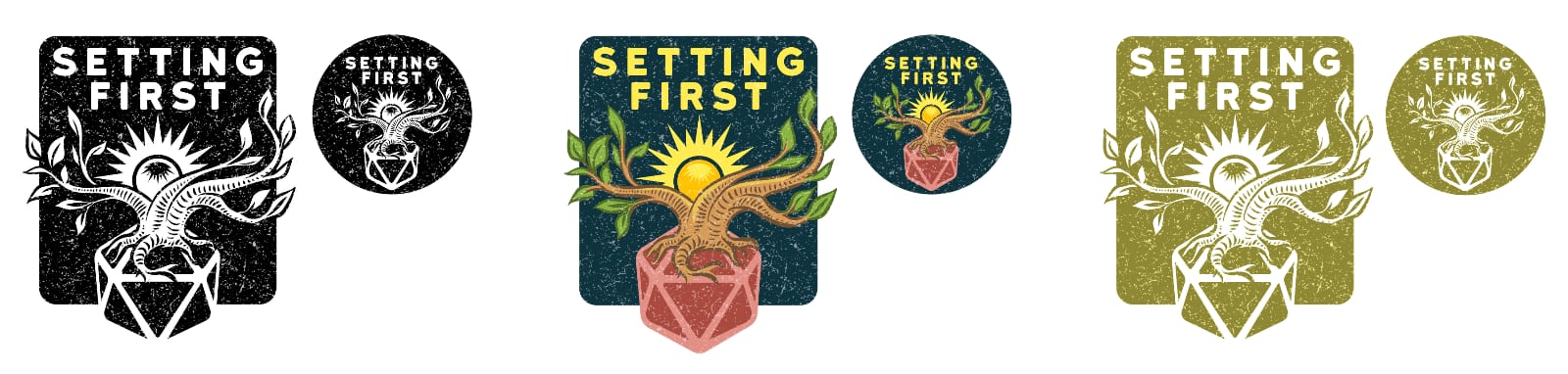
The slightly distressed olive-colored version is also really drawing me in. So I’m not sure how that fits in with the others, but I do like the idea of a color, a b&w, and a single-color logo-only version, and the distressed effect is eye-catching in a subtle way that also speaks to a lot of the post-apocalypse stuff I’ll probably be covering in the blog.
Those last bits of feedback gave Wouter what he needed to pull it all together into a unified whole. As soon as I saw these six variants of one strong logo, I knew we’d reached our destination. It really felt like magically my vague seed ideas had grown into something more robust and powerful than I could have imagined.
This is The Way
Wouter didn’t put me up to this, I swear. It was actually my idea, because I wanted to convey some of the excitement of working with a skilled professional illustrator. I wanted to show how the results were worth the time and money.
Right now there’s a lot of excitement about the images generative AI can produce. These technological developments are truly awe-inspiring. But the process of human artistry and the results it produces are so much more satisfying.
When the collaborative process becomes a real conversation where you are able to formulate thoughts freely and bounce ideas off each other, it’s quite similar to the excitement of a roleplaying session in which the story is being discovered through the wizardry of shared human creativity. That’s something that just can’t be achieved by prompting an AI that simply recycles existing material.
Ω